

IN THIS ARTICLE
Understanding the Kelvin scale
What Kelvin does not tell you?
Colour temperature in the space
Choosing the right colour temperature
Fixed or adjustable?
One part of the lighting design
Questions about colour temperature
#UNDERSTANDING LIGHT
Colour temperature, expressed in Kelvin, describes whether white light looks warmer or cooler. It does not describe brightness, colour rendering or glare, and two luminaires with the same Kelvin value can still look noticeably different. The right colour temperature therefore depends on the architecture, materials, daylight and use of the space – not on a fixed rule for each type of building.
THE ESSENTIALS
Understanding colour temperature
Colour temperature describes whether white light appears warmer or cooler and is expressed in Kelvin (K). Lower values appear warmer, while higher values appear cooler.
In architectural lighting, colour temperature is one of several factors that influence how a space, its materials and colours are perceived. It should therefore be considered together with colour rendering, light distribution, daylight and the purpose of the space.
UNDERSTANDING THE KELVIN SCALE
In modern electric lighting, the relevant term is usually correlated colour temperature (CCT). It describes the colour appearance of a light source and is expressed in Kelvin.
A few reference points make the scale easier to understand:
2700 K: distinctly warm
3000 K: warm, but less amber
4000 K: neutral white
6500 K: cool, comparable to overcast daylight
A higher Kelvin value does not mean that the light is stronger or better. It simply describes a different colour appearance.
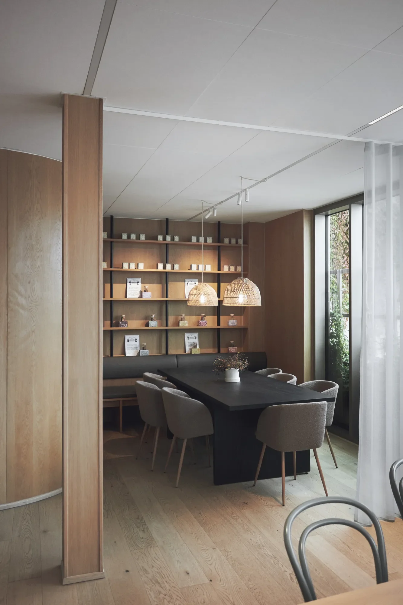
Søstrene Grene - Headquarter Aarhus
WHAT KELVIN DOES NOT TELL YOU
Two luminaires can both be specified at 3000 K and still produce noticeably different results.
Colour temperature does not tell you how much light reaches a surface, how accurately colours are rendered, where the light is distributed or whether it causes glare. Sources with the same CCT can also have different spectral power distributions. They may also differ slightly in tint – appearing marginally greener or pinker – and in colour consistency between units, often specified in MacAdam steps (SDCM).
This is why colour temperature alone is never a complete lighting specification.
COLOUR TEMPERATURE IN THE SPACE
Colour temperature affects how light interacts with materials, colours and architecture. Warmer light can emphasise warm-toned materials such as timber and brick, while cooler light creates a different relationship with pale, grey or cooler-toned surfaces.
There is no universal rule for which colour temperature belongs in a particular type of space.
Daylight also affects how electric light is perceived. Where colour and material perception are particularly important, the lighting should therefore be assessed in the actual context rather than from the Kelvin value alone.
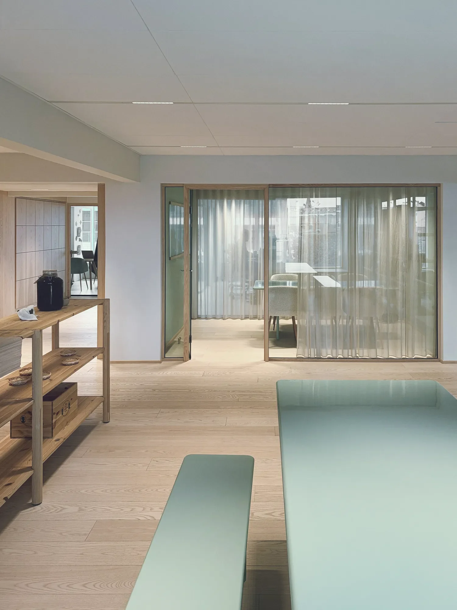
Søstrene Grenes Headquarter Aarhus
CHOOSING THE RIGHT COLOUR TEMPERATURE
Rules such as “warm light for hospitality” and “cool light for offices” may be useful as broad references, but they are too simple to define a lighting design.
The choice should respond to factors such as:
architecture and interior concept
materials and colours
use of the space
daylight conditions
visual tasks
colour rendering requirements
adjacent lighting
The question is therefore not simply Which Kelvin value is best? but Which colour appearance supports this particular space?
FIXED OR ADJUSTABLE?
Some lighting systems allow colour temperature to change.
Tunable white allows the colour temperature to be adjusted within a defined range.
Dim-to-warm lighting becomes warmer as the light output is reduced.
Whether adjustable colour temperature is relevant depends on the application and how the space will be used. It should serve a clear purpose rather than simply being included because the technology is available.
ONE PART OF THE LIGHTING DESIGN
Colour temperature is one design decision among many.
Architectural lighting brings it together with colour rendering, light distribution, visual comfort, controls, daylight, materials and the requirements of the space.
Kelvin tells us what kind of white the light appears to be. It does not tell us whether the complete lighting solution is right for the project.
Questions about colour rendering
What does 3000 K mean in lighting?
3000 K describes a warm-white colour appearance. It does not indicate brightness or colour rendering. Light output and efficiency are separate specifications, although the same luminaire may have slightly different lumen values in different colour temperatures – the datasheet shows the actual figures.
Is 4000 K brighter than 3000 K?
Not in measurable terms. Colour temperature and light output are separate characteristics, and two luminaires can deliver the same illuminance at different colour temperatures. Perceived brightness can vary slightly with the light’s spectrum, which is one reason lighting should be assessed in context.
Is warm light always better for hospitality and cool light for workplaces?
No. Colour temperature should be selected in relation to the space, activities, materials, daylight and overall lighting concept rather than from a fixed rule based on building type.
Is colour temperature the same as colour rendering?
No. Colour temperature describes the appearance of white light from warmer to cooler. Colour rendering describes how colours appear under that light.
Published: 28.092026
Related Knowledge
Colour rendering: CRI, R9 and how we see colour
Colour rendering describes how a light source affects the appearance of colours compared with a reference light.
Illuminance and luminance: what is the difference?
Understanding the difference helps explain why measured light levels do not tell the whole story about how a space is perceived.
What is architectural lighting design?
Architectural lighting design is the planning of how light works within a space.
Planning a project?
